

Data analysis fourth step: data pre-processing
The road so far
In the previous posts, we saw how important is to define a goal and the question beneath, how to collect data to get insights, and how to explore them to understand better the situation.
Now, the next step is to make an order from the chaos of your raw datasets.
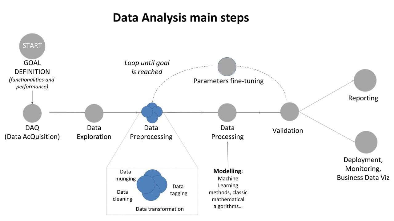
Figure 1: Data Analysis main steps: focus on data pre-processing
The road ahead
The main point of the pre-processing phase is to make sure your data can be used effectively from the model you chose to use. This phase is equivalent to prepare the ingredients of your recipe: you select, cut, modify, transform so that the data can be the inputs useful for that model specifics.
Thus, depending on the model, you will have to prepare your data in different ways. There are some typical actions to be done, and can be schematically divided into four areas:
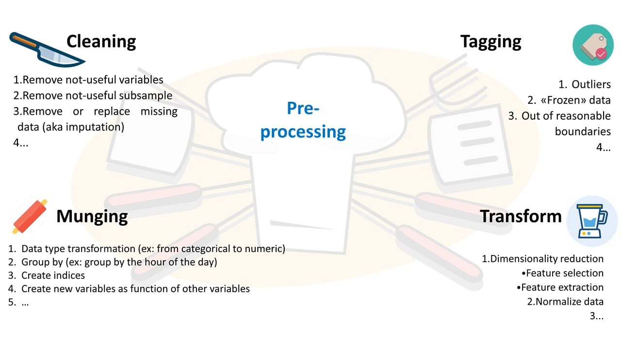
- A. Data cleaning 1. Remove not-useful variables 2. Remove non-useful subsample (ex: I decided that 2017-dataset is not needed for this analysis, so I drop it). 3. Remove or replace missing data (aka imputation) 4. …
- B. Not-nominal data detection and tagging 1. Outliers 2. «Frozen» data 3. Out of reasonable boundaries 4. …
- C. Data munging (wrangling) 1. Data type transformation (ex: from categorical to numeric) 2. Group by (ex: group by the hour of the day, make a running average…) 3. Create indices (some model can work faster with index-structures) 4. Create new variables as function of other variables (energy from power, kW from W…, a non-linear combination…) 5. …
- D. Data transformation 1. Dimensionality reduction 2. Feature selection (filter, wrapper, embed, Random Forests…) 3. Feature extraction (PCA, LDA, ISOMAP…) 4. Normalize data (sometimes absolutely needed from the model, for example in many machine learning methods) 5. …
For the sake of the description, I schematically divided the activities into four areas, but they are usually very connected between themselves, and sometimes you do not really need to do all of them (also, not in that specific order). In this sense, it is like a continuously refining procedure, going back and forth depending on what you find in the previous step.
Lesson Learned becomes tip and tricks!
Very important: always report how the dataset change over each step (ex: after missing removal, what is the percentual of the dataset lost?) It will be an easy double-check to look if you made some unintended error (yes, everybody does mistakes, and no, there is no shame in double-checking…).
Real-world example:
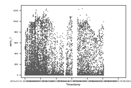
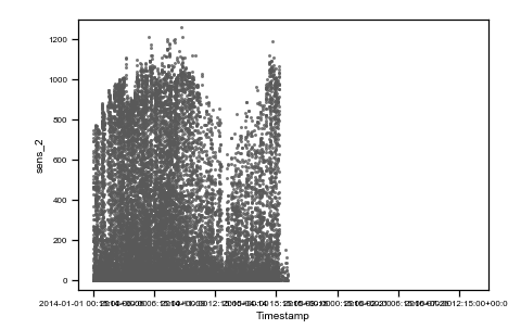
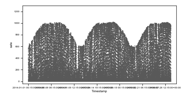
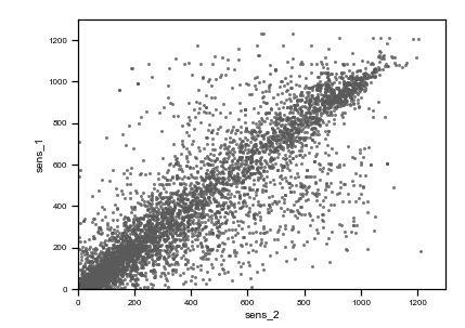
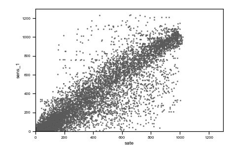
We use the same data of the previous post to describe a real-world situation. Data from two irradiance sensors and corresponding period satellite data are visualized in the following figure as they were acquired (raw data).
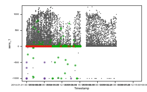
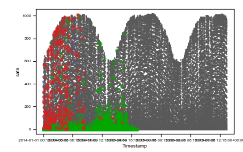
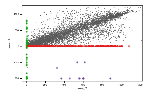
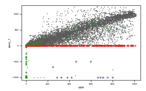
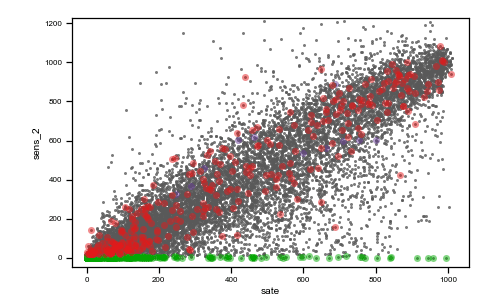
Caption: raw data plots. On the top, from left to right: time vs sens_1, time vs sens_2, time vs sate. On the bottom, from left to right, sens_2 vs sens_1, sate vs sens_1, sens_1 vs sens_2, sate vs sens_2. Colored points are related to the same events on all plots.
As you can observe, we highlighted with three different colors (red, green and purple) three different situations where data are not reasonable and need preprocessing.
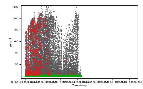
The red cluster corresponds to sensor_1 data all frozen = 0, and looking on the top time trend plot, these concentrate on the first part of the dataset. The second group of non-regular events is given by those highlighted in green. These are data where sensor_2 values are zero. Finally, the third interesting group is the one colored in purple, which are negative irradiance data recorded by sensor 1. Using the colored display, the dataset is better understood, and the comprehension improves. Then, we can tag non-regular data using simple mathematical algorithms (tagging) and then proceed to removal (cleaning) as in the following figure (much better-looking now, don’t’ you think ??).
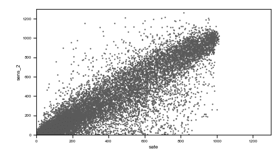
Caption: preprocessed data plots. On the top, from left to right: time vs sens_1, time vs sens_2, time vs sate. On the bottom, from left to right, sens_2 vs sens_1, sate vs sens_1, sens_1 vs sens_2, sate vs sens_2.
NOTE: tagging those data as not reliable allows us to look for the corresponding datetime and try to find the reason: maybe, in those days there were in-site inspections which causes malfunctioning in the data acquisition, we could contact the responsible to avoid the same problem next time.
Not regular data are not just garbage to be removed, and crisis can also mean opportunities (危机, even if this translation is not very appropriate)!
For the curious costumer
At i-EM S.r.l., we think that a long journey starts from a single and smart step; also, we know that the devil is in the details, and a good procedure can help to take them into account.
For the keen reader
Some further readings I found interesting (not so much as my post, sorry for you…).
- Data Cleaning in Python: the Ultimate Guide (2020) https://towardsdatascience.com/data-cleaning-in-python-the-ultimate-guide-2020-c63b88bf0a0d
- 7 steps in mastering data preparation https://www.kdnuggets.com/2019/06/7-steps-mastering-data-preparation-python.html#
- Handling missing data https://datascientistnotebook.com/2017/05/23/handling-missing-data/
- Preprocessing (and more) with python https://chrisalbon.com/#Python
- Detection of Outliers in Time Series Data http://epublications.marquette.edu/cgi/viewcontent.cgi?article=1047&context=theses_open
- Robust statistical distances https://www.datadoghq.com/blog/engineering/robust-statistical-distances-for-machine-learning/#notes
- Guide to Encoding Categorical Values in Python https://pbpython.com/categorical-encoding.html
- Imputation, feature engineering, feature selection: python example https://nbviewer.jupyter.org/github/addfor/tutorials/blob/master/machine_learning/ml01v04_prepare_the_data.ipynb
- Creating Python Functions for Exploratory Data Analysis and Data Cleaning: https://towardsdatascience.com/creating-python-functions-for-exploratory-data-analysis-and-data-cleaning-2c462961bd71
Author

Fabrizio Ruffini, PhD
Senior Data Scientist at i-EM