
Data analysis third step: data exploration
The road so far
So, you have your goal well set in mind and you found and stored some datasets.
Now, the next step is to look at your data, and listen to what they whisper.
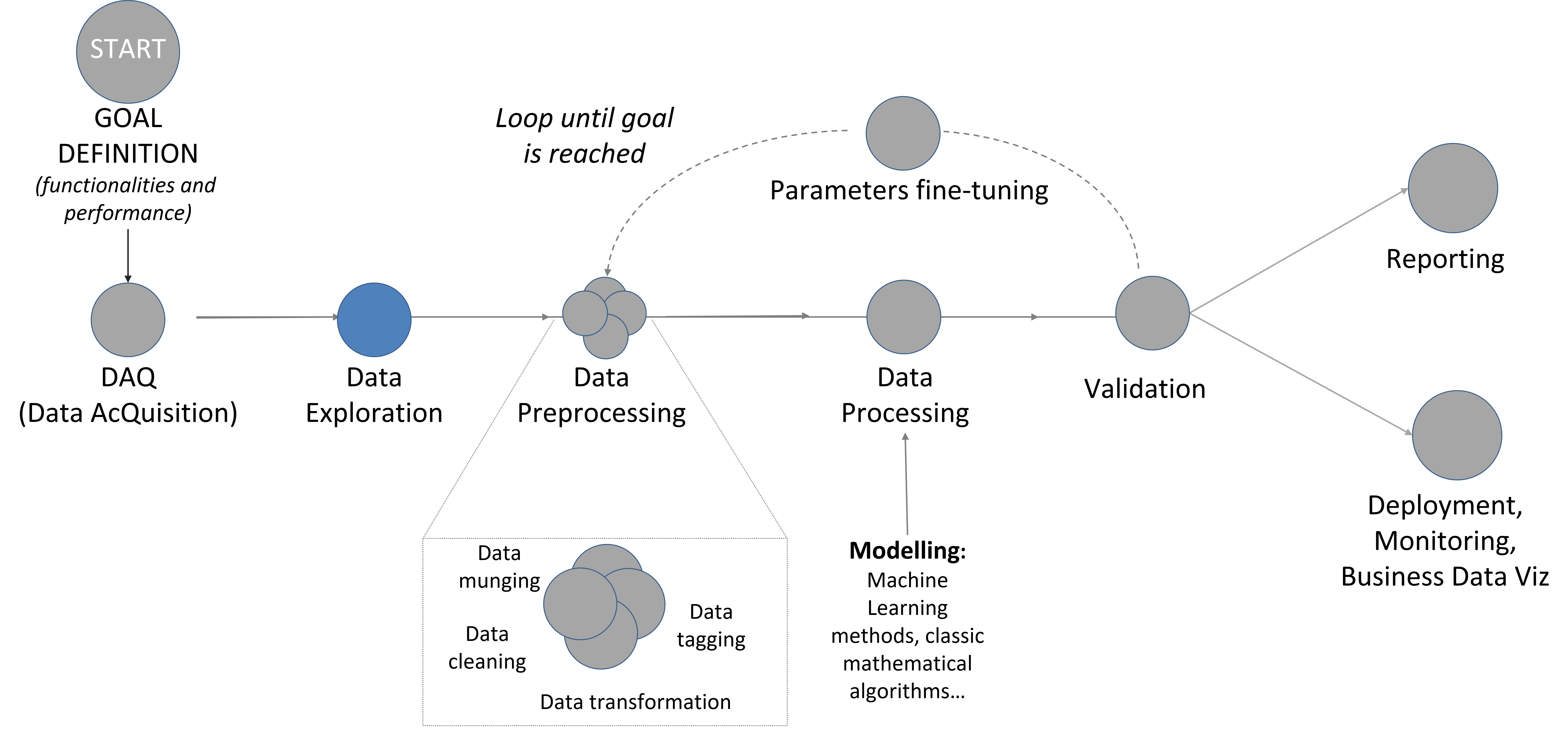
Figure 1: Data Analysis main steps.
The road ahead
In fact, the data exploration is not the procedure of finding what you look for, but it is the art of understanding what’s in front of you. Also, you will benefit from being curious about what you did not expect to find: surprises are waiting!
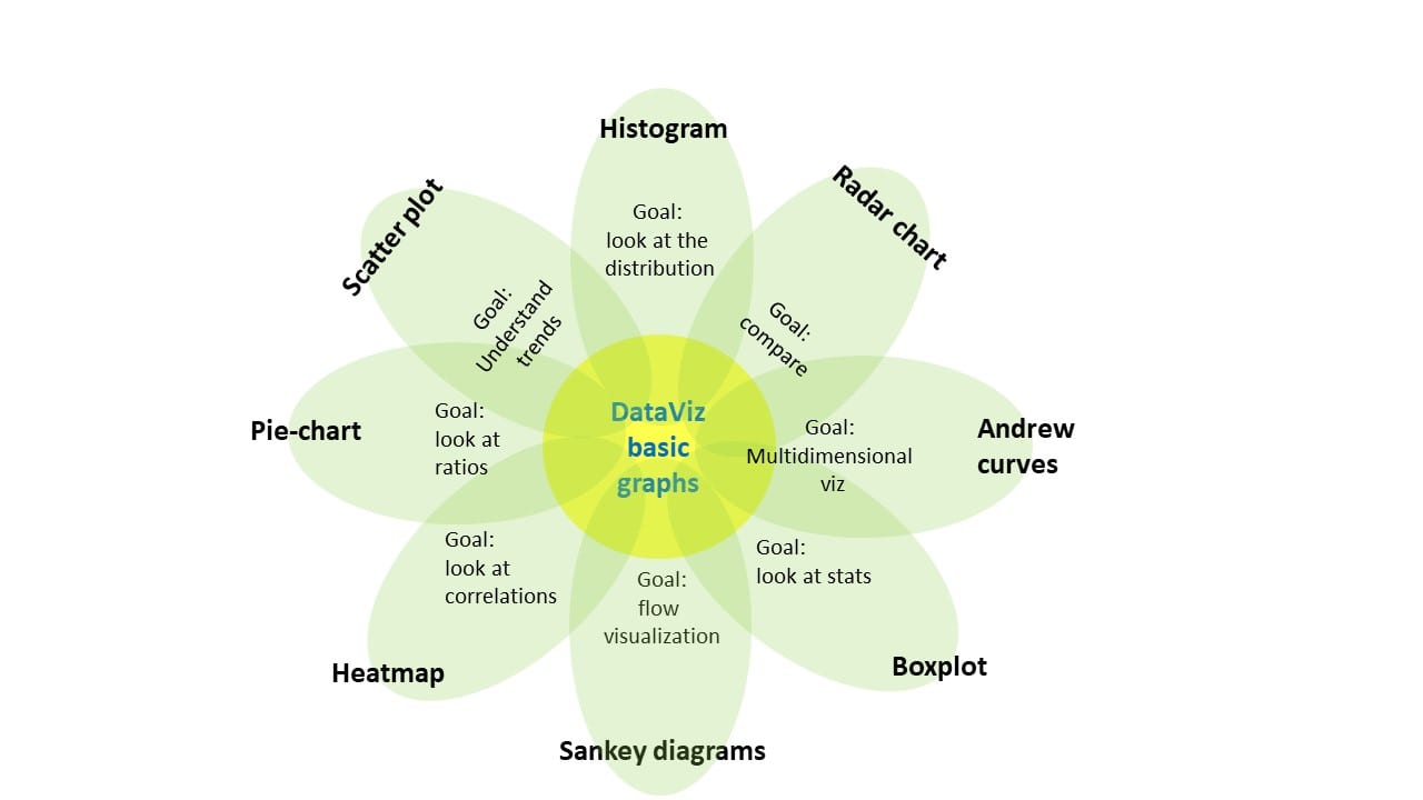
So, let’s start: the focus is, again, on the question: what kind of information I want to look at? Do I want to understand better a time-trend? Do I want to look at correlation between variables? Do I want to look at ratios as in pie-charts? To answer to these questions, you can choose to create a plot. There are different kind of plots focusing on different goals (see the figure below), but it is a good habit to look at more than one plot, to have a better comprehension of the dataset.
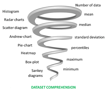
But first things first, before even thinking at what plot would answer your question, you really want to look at statistics. Here, you can understand if there are evident anomalies (for example: if the maximum value is very different from what you expect, the graphs will have some very unexpected behaviour).
Then you can create some plot or chart.
Then, the second step is (typically): “Mamma mia, there is something I do not understand! Why there are so many holes in my dataset? Why there are some data in this area (aka outliers?)”. And here comes the fun: try to understand what your data have to say. Is it worth? Yes, it is. You may understand something you did not know, or you just end up saying “Oh sorry, this is the wrong file”. What’s matter is the curiosity of going through in your data and see if you can find something valuable, even more than you expected.
To do so, you must have a preliminary idea of what you are going to find (i.e., your compass: the a-priori domain knowledge): if you have absolutely no idea of what the plot will be, you will try to explain even the inexplicable: it is somehow a cognitive bias, similar to the hindsight bias. But, if you have your compass, you would know BEFORE making the plot where data should be, and if they are not there or there is some unexpected pattern, you can learn from that. Discrepancies can be a (typically) human error (“Oh, my bad, the file is corrupted”) or something new and interesting (“Oh, look at you Performance Ratio, is going to zero, call the operator!”).
Lesson Learned becomes tip and tricks!
Graphs: Here a list of very useful (even if basic) graphs to look at, depending on your goal:
- Goal: look at distribution: Histogram
- Goal: understand trends and clusters: Scatter diagram (referred also as time-trend plot or run-chart, if you have “time” on the x-axis)
- Goal: have a multidimensional grasp of dataset features: Andrews curves
- Goal: comparison: Radar Charts
- Goal: look at ratios: Pie-charts
- Goal: look at stats: Box-plot
- Goal: look at correlations: Heatmap (most useful for correlations)
- Goal: visualization of a process flow: Sankey diagrams
NOTE: it’s good to have:
- a) interactive graphs linked each other to understand correlations (ex: glueviz tool)
- b) multidimensional plots to look simultaneously at different dimensions
Missing data: Check and reports missing periods that can affect data analysis. Preliminary statistical analysis: check and report mean, variance, percentiles. Do you expect this situation, based on your a priori knowledge and comparing with external datasources?
Statistics: again!
At the end, it’s always a good idea to compare graphs with basic statistics information, to enrich your comprehension of the dataset and eventually find anomalies, such as:
– number of data (and missing data)
– mean
– median
– standard deviation
– percentiles
– maximum
– minimum
– r-Pearson (assuming a linear correlation between two distributions)
Real-world example
Let us take a real-solar-world example: you want to do a preliminary assessment of a PV solar plant profitability based on some irradiance data you managed to acquire: a dataset from two ground sensors (sensor 1 and sensor 2); you also have a reference dataset for the same time period from satellite-based observations.
So, let’s start. Step 0 would be the question: I want to know if there is enough irradiance to build a pv plant. Step 1 is the statistics info: evaluate mean, median and other relevant scores.
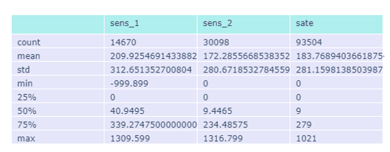
A-priori comment: from the statistics, we can see that sensor_1 has some anomalies with respect to the other variables: an abnormal minimum value of about -999, large median and a lot of missing values, while the maximum value is similar between the two sensors. Thus, I would expect a lot of missing in both sensors, even if I currently do not know where, and some strange behaviour for sensor_1. Since I do not know when the missing data are, I would like to see a time-trend graph. At this point the visualization is particularly interesting, since I already have something in mind and a new question: what sensor is more reliable and can be used for the energy assessment?
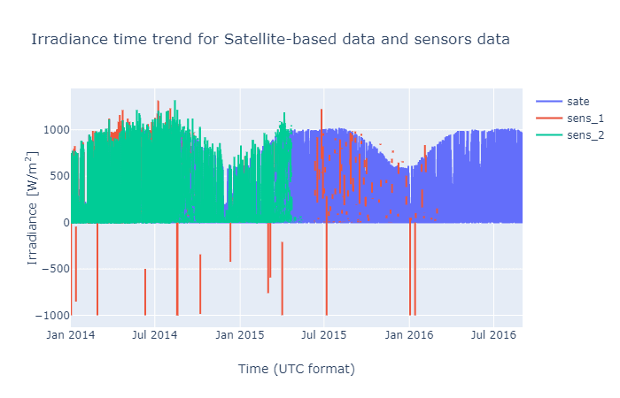
A-posteriori comment: from the time trend, we see that sensor_2 stops acquiring data around May 2015, while sensor_1 problem becomes evident around the end of 2014. After that, the data is scattered with many holes. Not to mention the negative values.
You can see how having paid attention both to the statistics and the plots give you more data comprehension as you step further. Now you can go also more in deep and look for example at the r-Pearson (or Kolmogorov-Smirnoff test) or the rmse statistics between the different datasets to understand if they are compatible with the assumption of coming from the same population.
Rmse(sens_1-sens_2) = 161 W/m2
Rmse(sens_1-sate)= 163 W/m2
Rmse(sate-sens_2) = 105 W/m2
r-Pearson(sens_1-sens_2) = 0.87
r-Pearson (sens_1-sate)= 0.87
r-Pearson (sate-sens_2) = 0.94
From the statistics, you can observe how the sensor_2 and the satellite-based data are quite in agreement, while sensor_1 dataset have some discrepancies. To understand what’s going on, you can look at histograms and scatter plots, that are typically the most suited to have a general idea of the scenarios.
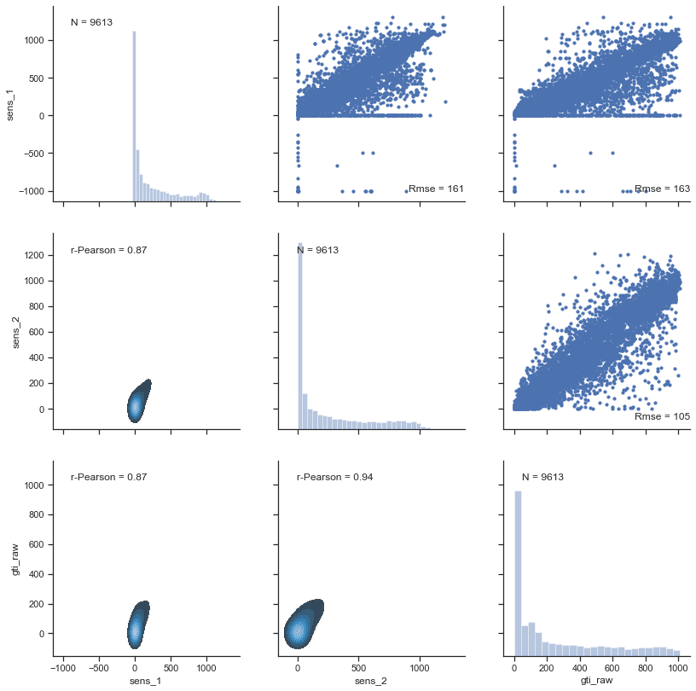
A-posteriori, after looking at the graphs, you can see that sensor_1 has different RMSE and r-Pearson values because of the negative values (and we already know that), but also because of some anomalous behaviour with “frozen”-like periods, when data have constantly the same values to 0, while sensor_2 and satellite-based data have not.
And this (could) conclude the quest for the question-answer: sensor_2 is better suited to evaluate an energy assessment with respect to sensor_1 (at least until data were acquired). Or it could make you question: “why there are frozen data in sensor 1?”, and you could use an interactive approach to understand why. Each step will give you additional descriptive knowledge on your dataset, and it can give you suggestions for corrective actions (aka this sensor really needs recalibration…). The next steps will eventually end up in pre-processing, where we will pre-process (clean) the data that are not physically reasonable, for example the ones with negative irradiance, and then we will verify whether the new r-Pearson is closer to 1. But this is meat for the next post.
For the curious costumer
At i-EM S.r.l., we think that a long journey starts from a single but smart step; also, we know that the devil is in the details, and a good procedure can help to be in control.
For the keen reader
Some further readings I found interesting (not so much as my post, what a pity…)
- https://www.datacamp.com/community/tutorials/exploratory-data-analysis-python?gs_ref=DWW3y9VNYV-Email
- https://towardsdatascience.com/exploratory-data-analysis-eda-a-practical-guide-and-template-for-structured-data-abfbf3ee3bd9
- https://towardsdatascience.com/visualizing-your-exploratory-data-analysis-d2d6c2e3b30e
- What is Exploratory Spatial Data Analysis (ESDA)? https://towardsdatascience.com/what-is-exploratory-spatial-data-analysis-esda-335da79026ee
- https://www.datasciencecentral.com/profiles/blogs/statistics-for-data-science-in-one-picture
- Creating Python Functions for Exploratory Data Analysis and Data Cleaning: https://towardsdatascience.com/creating-python-functions-for-exploratory-data-analysis-and-data-cleaning-2c462961bd71
Author

Fabrizio Ruffini, PhD
Senior Data Scientist at i-EM